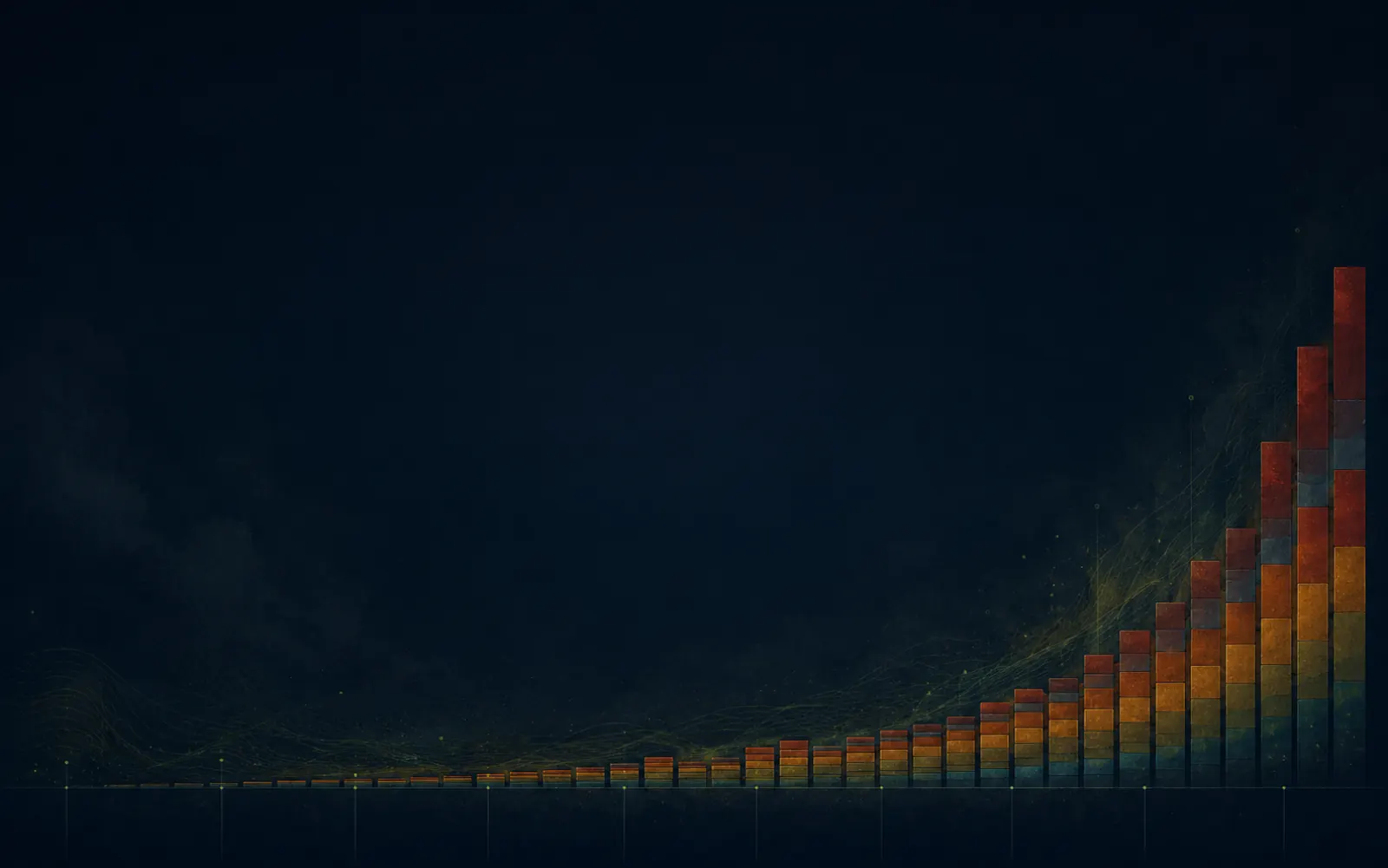
Fünf Jahrhunderte, gestapelt.
Vierzig dokumentierte Aussterben zwischen 1500 und heute, eingeteilt in Dekaden und gestapelt nach Taxon. Die Kurve wächst monoton, das Farbband zeigt, welche Gruppe was verliert. Fünf Anker markieren Arten, die ohne Bildunterschrift erkennbar sind.
Fünf Jahrhunderte, gestapelt.
Die kumulative Zahl dokumentierter Aussterben seit 1500, eingeteilt in Dekaden und gefärbt nach Taxon. Die Kurve wächst monoton: jede Dekade hält entweder das Niveau oder klettert. Die Welle läuft jedes Mal neu, sobald du wieder in die Sektion scrollst.
…
Die Kurve
Die Linie zählt nur Arten, bei denen letztes Sichtungs- oder Aussterbe-Jahr genau genug dokumentiert ist, um auf einer Dekade zu landen. Viele weitere Arten verschwanden ohne Eintrag. Die sichtbare Kurve ist die Untergrenze eines viel grösseren Verlusts.
Die Farben
Sechs Taxa teilen sich den Chart: Säugetiere, Vögel, Reptilien, Amphibien, Fische und Insekten. Säugetiere und Vögel dominieren, weil westliche Naturforscher sie früher und sorgfältiger beobachteten und benannten als andere Gruppen.
Die Animation
Jede Säule wächst aus der Grundlinie, sobald der Chart in den Viewport rollt, als Welle von links nach rechts über die Jahrhunderte. Scrolle weg und zurück, die Welle läuft erneut. Das Auge liest Zeit als Bewegung.
Die Schlagseite
Fast jede hier benannte Art lebte auf einer Insel, einem von europäischen Handelsrouten erreichten Kontinent oder dort, wo Naturforscher Tagebuch führten. Dies ist ein Chart menschlicher Aufmerksamkeit, nicht nur des Artenverlusts.
Tausendmal schneller als vor uns.
Die Hintergrund-Rate, der langsame Wechsel von Arten ohne menschlichen Einfluss, liegt bei etwa einer Art pro Million pro Jahr. Aktuelle Wirbeltier-Verluste laufen mit ungefähr dem Tausendfachen. Das Punkt-Raster unten ist der Vergleich im Massstab: ein grüner Punkt oben, tausend orange Punkte darunter.
Hintergrund-Rate
Etwa ein Aussterben pro Million Arten pro Jahr, gemittelt über Jahrmillionen Fossil-Geschichte.
Heute
Aktuelle Wirbeltier-Verluste liegen etwa beim Tausendfachen der Hintergrund-Rate. Jeder orange Punkt ist eine Einheit der Rate.
Die 1000-Faktor-Zahl stammt aus Ceballos et al. 2015 (PNAS, "Accelerated modern human-induced species losses"), einem konservativen Vergleich aktueller Wirbeltier-Aussterben zur geologischen Hintergrund-Rate. Andere Studien nennen 100× bis 1000×, je nach Taxa und Zeitfenster.
Was die Rote Liste heute sagt.
Fünf Wirbeltier-Klassen, jede bewertete Art in jeder Klasse gestapelt nach IUCN-Red-List-Status. Spaltenbreite proportional zur Anzahl Arten der Klasse, vertikaler Stack zeigt den Anteil pro Gefährdungs-Stufe. Amphibien stechen heraus: der grüne Streifen unten ist deutlich dünner als bei den anderen.
- Nicht gefährdet
- Potenziell gefährdet
- Gefährdet
- Stark gefährdet
- Vom Aussterben bedroht
- Ausgestorben
Bewege die Maus über einen Block, um den Status zu isolieren, oder über eine Spalte, um die Klasse zu isolieren. Zahlen unter jeder Spalte sind die total bewerteten Arten der Klasse (IUCN Red List 2024 Summary Statistics). Prozente für visuelle Klarheit gerundet.
Die meisten Verluste passierten auf Inseln.
Die 40 dokumentierten Arten aus Chart eins, neu gruppiert nach Lebensort. Inseln stehen oben, Kontinente unten. Jeder Punkt ist eine Art, gefärbt nach Taxon. Mauritius allein zählt mehr Einträge als mehrere ganze Kontinente. Kleine isolierte Populationen sind besonders verletzlich.
…
Bewege die Maus über einen Punkt, um Art, Region und Jahr zu sehen. Die 40 Arten sind dieselben wie in Chart eins: gleiche Daten, anderer Schnitt. Region-Klassifikation folgt der biogeografischen Standard-Aufteilung. Der Reveal kaskadiert Punkt für Punkt, sobald die Sektion in den Viewport scrollt.
Eine Kurve schaut zurück. Zwei Charts messen das Tempo. Eine Karte zeigt die Geografie des Verlusts.
Daten: IUCN Red List Summary Statistics 2024, Wikipedia (kuratierte Liste kürzlich ausgestorbener Arten), Ceballos et al. 2015 (PNAS) für die Hintergrund-Rate · 40 dokumentierte Arten + 5 Wirbeltier-Klassen · Alle vier Charts multi-trigger beim Wieder-Eintritt in den Viewport